
There are many advantages of responsive design for website owners and these have to do with SEO, reaching a larger audience and staying in synch with the latest trends in web design.
If you are an online business owner or webmaster looking for ways to keep your website and business on top of the competition, expand your reach, increase your conversion rates and keep your users happy then getting a responsive website should be your top priority.
What is responsive design?
For those that are not familiar with the term ‘responsive web design’, the simplest definition I can give is that a responsive web site is optimized for viewing (i.e. looks good) on different types of devices, screens and resolutions. In other words the design adapts to the available viewing space offering the user with a nice experience without having to move left and right with a scroll bar or zoom-in, zoom out in order to read the text or view an image.
To give you a real example, try to view the article you are reading now on a desktop or laptop, android tablet, ipad or smartphone. Try to turn the devices to landscape/portrait mode and observe how the design adapts to the screen size and resolution.
What is not a responsive design? A website that looks exactly the same on mobile as it looks on the desktop (but in smaller size) is not a responsive design. With a responsive design you can read, navigate and interact with a website on the device of your choice without having to zoom in or out.
It’s the latest trend in web design
Big companies lead the way when it comes to web design trends and responsive web sites are at the moment on the top of their list. Check out some very nice responsive websites from well-known companies:
- http://www.microsoft.com
- http://www.adobe.com
- https://www.reliablesoft.net

- http://www.thenextweb.com/
- http://techcrunch.com/
Do you need responsive design?
I will explain below why responsive design is a must for every modern website or online business but as Joshua Steimle mentioned in a Forbes article: Getting a responsive website should be your number one online goal unless you don’t depend on your website to stay in business or you have no competitors.
What is the difference between a mobile website and a responsive website?
Many people tend to confuse a mobile friendly website with a responsive website but that’s not exactly the same. A mobile friendly website looks good on mobile devices but may not look so good on devices with bigger resolutions.
In the majority of the cases, there is the desktop version of a website and then there are dedicated pages (usually on an m.subdomain) optimized for mobile which are different from those shown on the desktop.
While these websites look good on the desktop and mobile, if you view them on other resolutions the user experience is not so good.
With responsive websites there is only one set of pages (and one set of code) for a website and what is changing is the way those pages adapt in the different devices.
Let me give you a couple of examples to understand the difference of having a mobile friendly website and a responsive website:
1) WebMd.com
Webmd has a mobile friendly version but not a responsive website. Click on the images below to see that it looks great on the desktop and mobile but not so good when you view it on a different resolution.


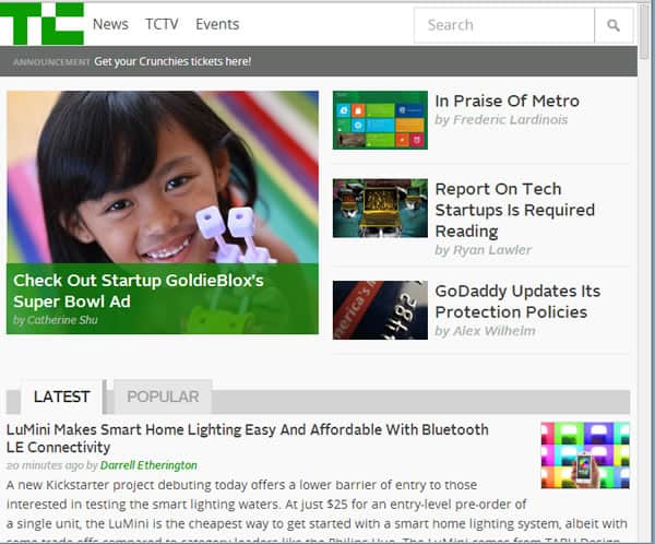
2) techcrunch.com
TechCrunch has a responsive website. Click on the images below to see how beautiful it adapts to all sizes and resolutions.


The easiest way to tell if a website is responsive is to change your browser width and see how it looks. If the design adapts well and the website still looks good then it is responsive. You can of course use online tools like this one that can help you test your websites on different devices/resolutions.
Is a responsive website the same as the native apps you can install on your iPhone or android?
Please note a mobile friendly version is not the same as native apps that can be installed on Android and iPhones. If you are not sure about the difference read this article: mobile website vs native app
Advantages of responsive design for website owners
So now that is clear what a responsive website is and what it is not, let’s see what are the advantages of having a responsive website for your business and how to justify the investment needed to turn your non-responsive website into responsive.
1) Reach more audience
There are many studies that came out since early last year (2013) showing the dramatic rise in the number of people who use their mobiles and tablets for all their online activities (social networking, shopping, researching, searching google etc).
Two of these studies are published by Google (here and here) with some very interesting findings, the most important are noted below and summarized in this custom infographic:
- Appearing on smartphones is critical for local businesses. 94% of smartphone users look for local information on their phone and 84% take action as a result, such as making a purchase or contacting the business.
- 77% of users have researched a product or service on their device, and 46% of smartphone users have made a purchase on their phone
- 67% of people start shopping on one device and continue to another
- 65% of sequential shopping occasions are started on a smartphone
- 34% of people turn to the screen that’s closest when looking for information.
What does this mean for businesses? If you don’t offer your users or potential customers a good experience on the device of their choice, you may lose visitors or customers. On the other hand, if you make sure that the experience they will have on the various devices is good, you are more likely to retain them as visitors and later convert them to customers.
2) Your customers are already mobile, stay in touch with them
Most probably if you check your analytics, you will find out that already 10% – 30% of your visitors are coming from mobile/tablets and if you are not offering them a user friendly version you are losing customers.
So, the added advantage of going responsive is that it will enable you to keep in touch with your customers and engage with them on every possible occasion.
3) You have one website to maintain and one set of code
As mentioned above, the beauty of having a responsive website versus a mobile friendly version is that you only need to maintain one set of code, one set of pages for your website so any changes or new functionality you offer to the desktop version are automatically available on mobile as well.
4) SEO benefits from responsive design
There has been a long discussion in the SEO industry about responsive website and SEO. Some people say that it’s good for SEO, others believe that a responsive website is not the best solution for all businesses while Google is saying that having a responsive website is the recommended configuration for creating smartphone optimized websites.
In my opinion a responsive web site is good for SEO because:
- You have content published only once so there is no risk of getting into duplicate content issues
- Any efforts you put on SEO for your desktop version are ‘automatically’ applicable for mobile as well
- You are offering your mobile users an optimized version so you are more likely to rank higher on mobile search
- It is recommended by Google – Although that does not mean that they will favour this method over the others, they do suggest that having a responsive website is the best practice.
5) Increase conversions and earnings from ads
By going from a mobile friendly version to a responsive website you are more likely to increase conversions or earnings from ads.
Migrating 3 AdSense websites to responsive design resulted in 20-30% increase in AdSense earnings compared to mobile friendly versions.
Details of these case studies will be published in the next few weeks (so stay tuned) but the increase in AdSense is a clear indication that responsive websites increase conversions as well.
Data from our clients who are selling products online, support the above statement and this is also something we will publish with more details soon.
In the meantime, you can also read how these 14 brands increased their conversion rates by going responsive.
6) Stay in front of the competition
It’s becoming an industry standard so by staying in synch you are a step closer to your competitors (or ahead if they are not following a responsive design).
7) You are preparing now for the future
The future of the web is mobile and it is estimated that by 2017 more than 5 billion people will use mobile phones. These are numbers and figures you cannot ignore and if you are not convinced that a responsive website can help your business now, it will certainly do in the next few years.
8) Offer a consistent design across all devices
A responsive website can help you maintain a consistent design across devices rather than serving your users with a different set of pages for each type of device that may have a different look’n’feel.
How can you make a website responsive?
It is not the purpose of this article to go into the technical details on how to make a responsive website but I can give you some guidelines and examples on what we have done for other clients.
Websites can be designed responsive from the beginning or can be converted into responsive later.
There are 2 ways to make a responsive website:
1) Use a responsive theme – if you are using wordpress there are a number of ready-made themes that are also responsive so you can buy one out of the shelf and use it.
2) Transform your existing website and theme into responsive design.
3) Create a custom design from scratch that it’s also responsive.
We have converted many non-responsive websites to responsive, some examples are shown below:
The nice thing about migrating from non-responsive to responsive is that the desktop version stays the same. The look n feel of the desktop website does not change in any way so you don’t have to worry that a responsive design will break your website’s theme.
So far and from our experience it is possible for almost any type of website (especially wordpress websites) to be made responsive.
How much does it cost?
If you planning to use a pre-made responsive theme then the difference in price compared to non-responsive themes is not important.
If you are designing your website from scratch then the responsive design may cost you 10% more than a non-responsive website (of course this depends on the actual design).
If you want to migrate your existing website to responsive then this may cost from a few hundreds to a few thousand dollars depending on the complexity and setup of your website.
If you want to find out how much will it cost to make your website responsive, contact us and give us more details about your website and we can sent you a quote.
Are there any disadvantages from responsive design?
No technology or design methodology is perfect and responsive web design is not an exception to this rule. Nevertheless it should be noted that the advantages are far more important than the disadvantages. In my opinion the most important disadvantages of responsive design are:
Not suitable for complex websites that use specific mobile functions – for example if a website uses cameras, GPS or other mobile functions then a mobile friendly website may be more appropriate than a responsive website.
If not done correctly, can slow down the mobile version of a website – when making a responsive website you should always have in mind that it should load as fast as possible on mobiles and should only show items that the mobile browser can display. If these rules are broken then the results will be opposite.
Responsive web sites do not work on Internet Explorer 8 and below.
Conclusion
A responsive website design is a must for all types of websites. Whether you are selling products online, promoting your services or running ads a responsive design can help you increase your traffic, make more conversion or earn more from your ads. Almost all websites can be made responsive, the cost depends on the complexity of website and platform that it is build.
You can contact us today to give you an estimate on how much it will cost you to make your website responsive and benefit from the advantages explained above.
Advantages of responsive design for online businesses by Alex Chris
